FC 26 KITS
This page shows you a selection of the best FC 26 Kits.
FC 26 Kits
Choosing a kit for your club can be challenging. With more than 1,500 options in the game, each with its own colors, patterns, and sponsors, the variety is vast. If you already have a kit in mind, simply visit the transfer market and filter by the club you want.
In Ultimate Team, every club needs an active home kit and an active away kit, while some of the bigger clubs also have a third option. These kits are purely cosmetic and do not affect gameplay.
Many players stick to the jerseys of their favorite real-world clubs. However, the most sought-after designs often come from lesser-known teams, offering fresh, unique styles that stand out and spark creativity.
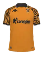 |
HOME KIT 25 Being at the end of the list doesn’t mean it’s not a good kit, just that there are others we like more. Hull City’s creation for this season revisits the black-and-amber tiger print from the early ’90s, while still keeping the club’s identity intact. |
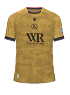 |
AWAY KIT 24 Here’s another example of an almost perfect kit, if not for the rather distracting front sponsor. It features a rich gold base embossed with tonal prints of local landmarks, blending heritage, place, and design beautifully. |
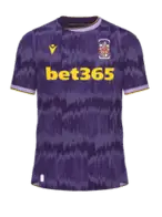 |
AWAY KIT 23 The Stoke City away kit revisits the iconic 92-93 design, featuring a purple base with jagged light-purple graphics. It leans into nostalgia with style, giving fans a sense of history and flair in one shirt. We bet you’ll like it. |
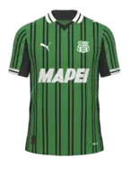 |
HOME KIT 22 This shirt mixes past and future with its ‘Fast Green’ base sliced by classic black vertical stripes; a renewed polo collar and contrasting white/black finishes on the cuffs add polish. This solid pick honours the club’s roots while feeling fresh and premium. Isn’t it great? |
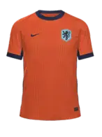 |
HOME KIT 21 This is a long-standing passion. It’s impossible not to be moved by the sight of Dutch fans filling the stadiums in these jerseys. That’s one of the many aspects that makes football so captivating. |
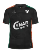 |
HOME KIT 20 Venezia’s kits have consistently been among our top picks year after year, often ranking near the very top. However, ever since they added front-of-shirt sponsorship, they’ve lost a bit of their shine. It’s still a work of excellence, but no longer quite enough to be considered the best of them all. |
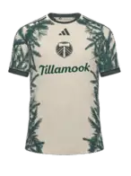 |
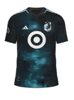
AWAY KIT 19 The Nature Unites kit, as it’s officially called, features floral elements that celebrate Oregon’s native trees. But looking only at the shirt is seeing just 50% of its beauty. It’s when you see the full kit that you realise just how well executed it really is. |
 |
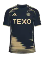
HOME KIT 18 We could highlight the kit’s connection to the Mississippi River, but the truth is it goes far beyond that. Aesthetically, it brings together several elements seen in some of the most beloved kits in Ultimate Team history. We’re confident you’ll love it. |
 |
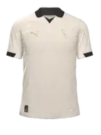
AWAY KIT 17 Dubbed ‘The North Sea Kit’, it features a deep navy base paired with Golden Sand detailing, logos and accents that evoke the city’s maritime legacy. It is a beautiful visual storytelling rooted in place, not just colour. There are only two options with this kit: love it or hate it. Which side are you on? |
 |
HOME
KIT 16 If you’re looking for a clean and minimalistic kit, Port Vale’s uniform is the perfect choice. The retro gold ‘PVFC’ crest adds a touch of vintage charm, and the absence of a front sponsor keeps the look minimal and classic. A true embodiment of minimalism. It looks to be made for collectors. |
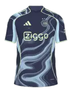 |
AWAY KIT 15 Inspired by the canals of Amsterdam and celebrating the city’s 750th anniversary, this kit has something unique. It’s more than a kit, it tells a story, blending local culture with standout visual appeal. Celebrate with them! |
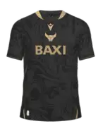 |
AWAY KIT 14 Oxford United break from tradition with a bold black away kit, elevated by gold details on the collar, sleeve cuffs, sponsor and Macron logo. We like it because it combines sleek modern design with meaningful club references, making it feel both premium and personal. |
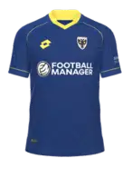 |
HOME KIT 13 This kit brings back its classic royal blue as the predominant colour, accented by a sharp yellow polo collar and yellow sleeve cuffs. Despite the great colour choice, what we love most about this shirt is the sponsor. As football fans, we simply couldn’t resist playing FC with Football Manager on the chest. |
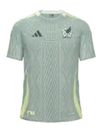 |
AWAY KIT 12 The Mexican national team is back! While this kit may not be as striking as some from previous years, it still stands out above the average. The away jersey features a light green color with an all-over design inspired by Mesoamerican culture. |
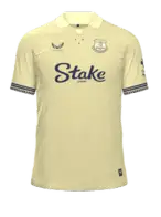 |
AWAY KIT 11 Everton go pastel yellow with this season’s away shirt. It looks classic and soft but has local meaning; it balances elegance with identity, giving fans something more than just colour but also roots. It’s the perfect choice for those who appreciate elegant and understated designs. |
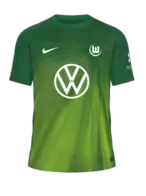 |
HOME KIT 10 It’s very difficult for gradients to work well on a jersey and that’s why we value Wolfsburg’s so much. If you’re looking for a green jersey, then you don’t need to look any further. You won’t find any more good-looking than this one. Guaranteed. |
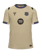 |
AWAY KIT 09 Bold, cultural and eye‑catching, combined with the weight of responsibility that comes with wearing the jersey of one of the most famous club in the world. It’s a fan favorite within the Ultimate Team community. |
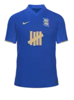 |
HOME KIT 08 Sometimes a single-color shirt can be the best choice. And if the color is good, so much the better. That’s why we like the Birmingham jersey so much. That’s why and because we want to stay undefeated. Will you be using it? |
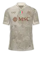 |
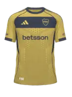
AWAY KIT 07 This kit leans into the ‘Proud to be Napoli’ mantra, with an off‑white (cream) palette overlaid by a tonal graphic rich in Neapolitan symbolism. Gold logos and trim elevate the look while the simple collar and cuffs keep it clean. If it didn’t have a sponsor, it would be the perfect kit. |
 |
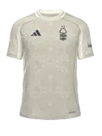
AWAY KIT 06 In our opinion, it’s one of the most successful South American jerseys of the decade. Besides representing one of the continent’s heavyweights, it manages to differentiate itself greatly from all the other choices in this selection we made. The horizontal stripe across the chest area only attests to its quality. |
 |
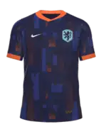
AWAY KIT 05 Clean and stylish, all in one shirt. Its design is particularly interesting because it combines local historical elements with modern aesthetics. The use of cream as the main color is an elegant choice that moves away from the club’s traditional reds, while the reference to the Lace Market adds an authentic cultural connection. |
 |
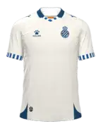
AWAY KIT 04 It’s true we had already selected one of the Netherlands shirts, but we can’t be blamed for both being that good. This one breaks away from tradition, introducing a striking all-light-blue design with a bold, abstract graphic pattern across the shirt. It’s a fresh, modern take that’s become a fan favorite for its clean yet expressive style. |
 |
AWAY KIT 03 This shirt features a refined beige tone, complemented by navy details on the collar, cuffs, and logos. The club crest appears in a clean monochrome version for the first time, giving the kit a sleek, contemporary feel. We love it! |
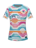 |
AWAY KIT 02 San Diego is back! This jersey captures the essence of a San Diego sunset, infusing the club with vibrant energy. Its bold orange, pink, and turquoise wave-like pattern symbolizes the meeting of ocean and sky, representing America’s Finest City. Isn’t it great? |
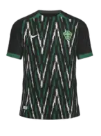 |
AWAY KIT 01 It’s time to announce this year’s winner. Following in the footsteps of fantastic kits from previous years, such as those of Bournemouth, Ajax, Benfica, and Venezia, this time it’s the away jersey of Elche that catches our eye. It features a bold design, pairing a black base with sharp green and white accents, blending tradition with a modern edge. Amazing kit! |
4.7
3
votes
Article Rating
Subscribe
Login
0 Comments
Newest
Oldest
Most Voted
Inline Feedbacks
View all comments